In this article, you can find information on setting the background of the header as well as its appearance.
To open the settings, click on the gear wheel icon in the upper right corner of the header.
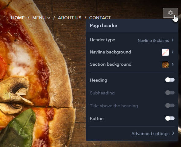
Header type
Here you can change the header type, you can choose from the options Navline only, Navline & claims or Navline & content. The header can be set directly for each page on the project.
Navline only
With this setting, only the logo and menu bar are displayed, followed by the rest of the site. You can change the background and set the properties of the navline. The navline settings affect the bar settings on all pages of the site.
Within the navline, you can change the background by clicking on Navline Background.
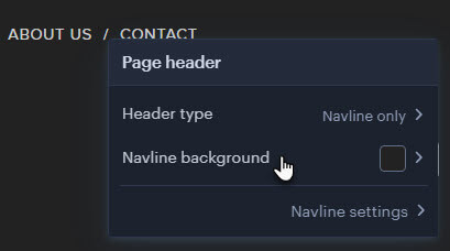
You can also select one of the recommended backgrounds or use the plus button to select another or upload your own.
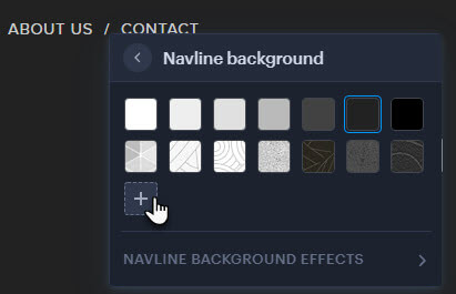
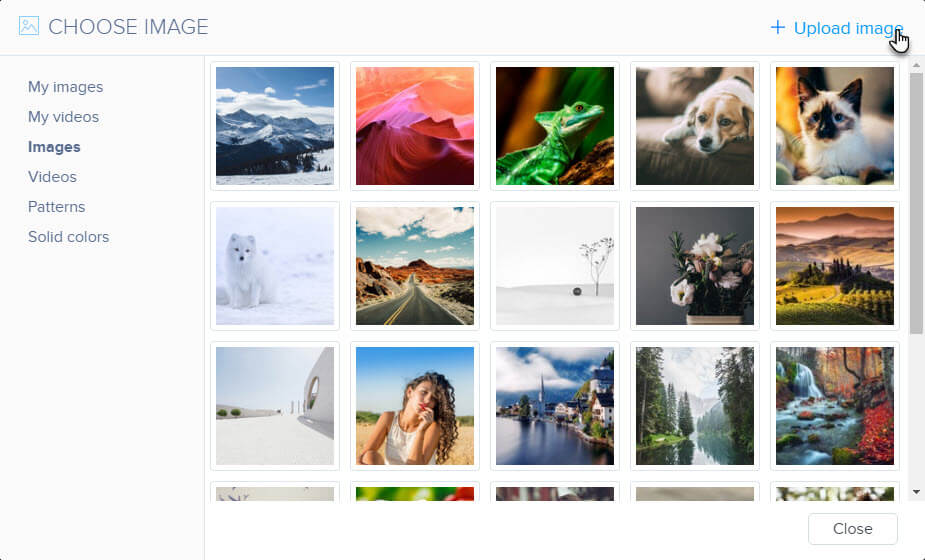
Here you can select a background from the gallery or upload your own.
If you set a background other than monochrome, you will also be able to set Background Effects, such as a Color overlay or Animation.
Advanced navigation bar settings
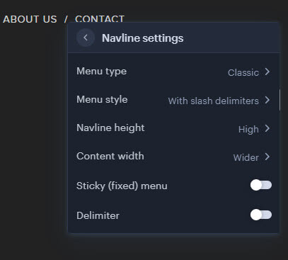
Menu type
In this step, you can change the position or appearance of the menu items. Types Classic, Centered, and Bottom. Boxed hamburger and Hamburger differ in the icon.
Menu style
The menu style sets the appearance of the page names in the menu. For example, menu items can be bordered, crossed out, have larger spaces, or behave differently when you hover the mouse. This setting cannot be made for the Pop-up and Tile with Pop-up menu types.
Content width
Use this setting to adjust the distance between the logo and the menu items in the navigation bar.
Sticky (fixed) menu
When the fixed menu is switched on, the navigation bar remains at the top even when the mouse is moved down the page.
Delimiter
This option turns on the line that separates the navigation bar from the rest of the page.
Navline & claims
This type of header is generally used on most template home pages. You can add up to three headings (Heading, Subheading and Heading above the title) as well as a button. The background can be changed for the navline and section.
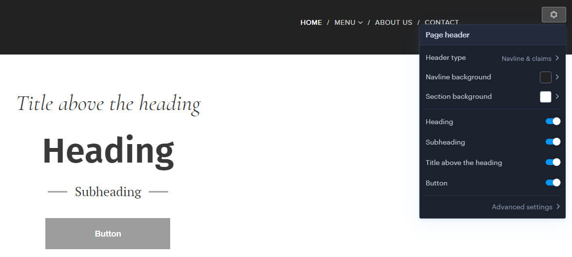
In addition to the Background of the navline, you can also change the background of the header itself by clicking on Section background.
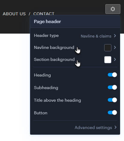
The recommended resolution for the header image is 1920 × 1280 px, and the file size should be around 600 kb. Larger image sizes could result in slower page loading and more data being transferred.
The change procedure is the same as for the navline (see above in the article).
Advanced settings

Content alignment
Here you set how the content will be aligned within the page header.
Content width
The width of the content within the header type. The navigation bar and headings mainly define where the content starts. For example, when aligning content to the left, you can set where the headings start.
Minimum height
This setting determines the size of the header. This setting can be useful if you want to determine how much of the background image should be seen.
Decorative border
This feature activates a dark border around the title, subheading, and caption above the title.
Advanced navigation line settings are the same as for other header types.
Navline & content
You can insert any type of Webnode content, such as forms or image galleries, into this type of header. The background for the navline and the content can be set separately.
You can change the background of the navline and section as you would for the Navline & Claims header type.
Advanced settings
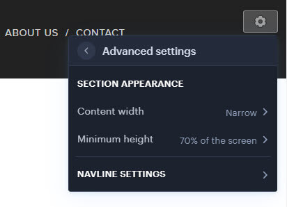
Content width
The width of the content determines the size of the content – forms, photo galleries – that is placed within the header.
Minimum height
The minimum height defines the size of the header and its space for content.
Advanced navigation line settings are the same as for other header types.

